A Kitchen Banquette
I’ve always dreamed of having a window seat that would double as a banquette area. Banquettes are so beautiful and cozy and I think they are wonderfully kid-friendly!
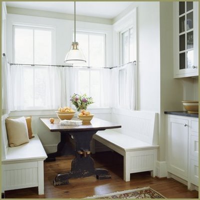
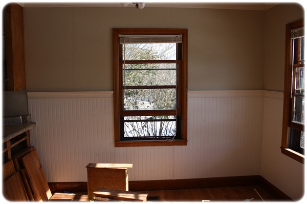
I’m thrilled at the prospect of actually having a banquette in our breakfast room. {happy squeals} With a banquette coupled with fabulous beadboard wainscot, I think I might just die from swooning.
{still under construction}
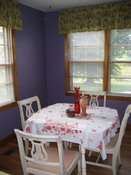
Our breakfast room doesn’t have loads of space {especially with cabinet doors and drawers strewn about, ahem}, so using a banquette in this area will allow the table to be somewhat out of the traffic pattern. It will also allow us to accommodate more seating than when we lived here before.
{my soul, what was I thinking?}
Umkay, moving on…
I drew two different options so you could get an idea what I’m thinking about.
Exhibit A
My symmetrical-loving-self, loves this design and how it works with the double window. At the same time, I think it would be neat to look in the breakfast room from the living room and see the banquette under the single window.
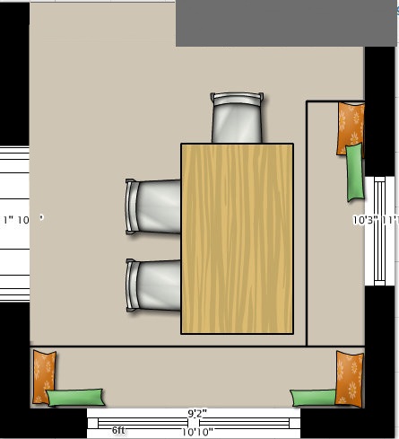
Would an L-shaped banquette box in the room {pun intended} too much? I think it could also make getting in and out of the banquette more difficult.
Decisions, decisions.
What do you think – Exhibit A or Exhibit B?

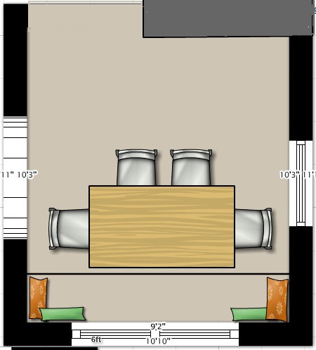
Voting for Exhibit A…rather addicted to symmetry, myself….
As a side note, if you decide to have your built-in window seat/banquette double as storage space, consider front-access, rather than lift-the-seat access. The under-the-seat access design has proven to be a real pain (sometimes, literally) with my parent’s banquette.
Fab advice Kate! Thank you! 🙂
Love your new project. I am doing a similar thing with the home that we live in. I had to live here for a while to know what I wanted to do kind of a thing. Good luck, I know it is a labor of love.
Thank you Cindy for your sweet comments! 🙂
I think either way would work but the first one looks like more room. I agree with Kate storage in the seats is nice until you want something out of them. My grandparents had the bench type and they worked well.
I like exhibit A much better, it’s the symetry thing!
Just found your blog last week – I like Exhibit A, definitely!
Allison, I’m so grateful that you found my blog! 🙂 Thanks for your input! 🙂
Voting for A. We will be adding a banquet to our kitchen as well this year. I am so excited about it!!
Joy, I know you’re thrilled with having a banquette in your house! How fun! 🙂
I’m so excited to have found your blog! I don’t even know how I got here! LOL… I have some MAJOR projects that REALLY NEED TO HAPPEN in my house, and I’m thrilled to have found your blog to help me! Thank you so much!!!
Semalee @ Nailing Jello to a Tree
Yay Semalee! I’m so glad you’re here!! 🙂
DEF Exibit A. Love that!!
Love your new site. I think I like A!
We just finished a major kitchen remodel. Here is the big reveal post:
http://twopeasandtheirpod.com/kitchen-remodel-the-big-reveal/
It was a lot of work, but so worth it! I can’t wait to see how your projects turn out!
Thanks Maria!! 🙂 Love your kitchen reveal! Beautiful!
I vote for A! 🙂
I vote for A!!!
how funny. i thought the obvious choice was b. probably because i like to sit on the comfy benches 🙂 i’m excited to have found your blog! we just built a (tract) house and i am so excited to have the opportunity to make it our own. i’ve bookmarked you and am looking forward to following your house transformation!
Ha! Thanks Ellie for your comment! I was thinking with “b” that it would be nice to just cozy up and look out the window. Thank you for following along!!
I really like A! The L shaped bench in B does not get utilized as much. Option A seems more open if someday you decide to move the table away from bench and use chairs again. Have fun!
Thanks Jennie! 🙂
While I am a die-hard symmetry fan… I think I prefer B. My thoughts?
Well, built-ins ALWAYS look classy and have major design impact. Plus, they could offer much needed storage (who doesn’t need storage).
What about C? Shorten the bench on the right and turn your table to the direction that it is in A? That would feel more symmetrical and give you more built ins, and one less chair.
Good luck. Of course… ignore all of us and trust your instincts!!!!
Thank you Darlene! You are AWESOME! 🙂
I vote for A as well. I’ll echo the other commenter who mentioned front-access storage…that makes a lot of sense!
I’m visiting from Tatertots and Jello. Nice to *meet* you. 🙂
I like both, but I think exhibit A will make the room feel bigger.
I never considered a banquette because I figured you needed a perfect nook or bay window for it. It never occurred to me that you could just use any old corner! I will have to completely rethink how I set up our dining areas from now on. Thanks!
Laura, I appreciate your comment so much! Let me know if you change up your dining room! 🙂
I vote for choice A! While I love the L-shaped seating, I agree that it would make it harder to get in and out.
x
Than k you Carly for your input!! I truly appreciate it. 🙂 I’m leaning toward A too!
Why not both? Use the L-shaped banquette, and place the table in position A. Just loose one chair. That way you get the maximum amount of seating, and a bit of symmetry. BTW, love the new site.
Great idea Mareka! Thank you for your sweet comment!! 🙂
I prefer A, but I like Darlene’s suggestion if you wanted more storage/seating.
Thank you Kerry for your input! I truly appreciate it. I’m leaning toward A myself… 🙂
Myra,
I love banquettes and am considering one myself right now. I definitely like A better. Can’t wait to see the project as you go along. I am excited about your new blog. I look forward to seeing you soon!
God Bless Ya!
Denise
Thank you Denise! You are so kind!! 🙂 I’m definitely leaning toward “A.” I got my table in there yesterday, so I can kind of eyeball it now. 🙂 xo
Hi there! Just found you through Tatertots and Jello. Looking forward to following along. Good luck!
Welcome Kate! I’m so so glad you’re here!! 🙂
I’m with you on the symmetry, plus, I just thing that layout looks more convenient and flexible. Definitely Exhibit A!!
Thank you Amanda! I’m definitely leaning toward Exhibit A. 🙂
Personally, I’m voting for C ~ best of both worlds! 🙂
LOL! Thanks Mandy! 🙂
I vote for A. Storage under the bench would be great. Use cabinet doors. Easier access.
Thank you Cathy!! 🙂 Love the cabinet doors idea..thank you!
you are amazing!
look at your 2 graphs! fantastic detail.
i thinking A, but Darlene (?) has a valid point. storage. i would do anything for more storage!
(blush) No, girl, you are amazing! I guess we could go back and forth, huh? 🙂
I am voting for B! I love that there is more bench space just other than at the table. My husband and I have a similar story to yours! We also live in an old home (1925) that we did an owner finance. Love that we have a secure (legal) mortgage also! It is our work in progress. I have just recently found your blog through moneysavingmom.com and it is just awesome. You are so creative and you give me some motivation. Thanks for your great posts!
Thanks so much Amanda for your sweet comment! I’m so glad you found my blog! 🙂
I know I’m late, but I like “A”…guess because everyone at the table can see out of the window at the same time! I love being able to sit at the table and look out the window. We would love to have a “banquette” but no can do. No room. But hubby has promised to build me a bench for the boys to sit on at the table, with storage underneath. 🙂
Thanks for the great posts!
Thanks Ann! We haven’t started yet on the banquette…hopefully later this month! 🙂 I always love hearing from you! 🙂